In the previous chapters, we learned how to estimate the parameters of a regression model using OLS. We discussed how, under certain assumptions, our OLS estimator \(\hat{\beta}_j\) is unbiased—meaning that on average, across many hypothetical samples, our estimate equals the true population parameter \(\beta_j\).
But here’s the catch: we only ever observe one sample. Our single estimate might be too high or too low relative to the truth, simply due to the random variation inherent in sampling. Statistical inference is the set of tools that allows us to quantify this uncertainty and make statements about population parameters based on sample data.
The central question of statistical inference is: Is our single OLS estimate “real,” or is it due to random chance?
6.2 The Sampling Distribution: A Simulation
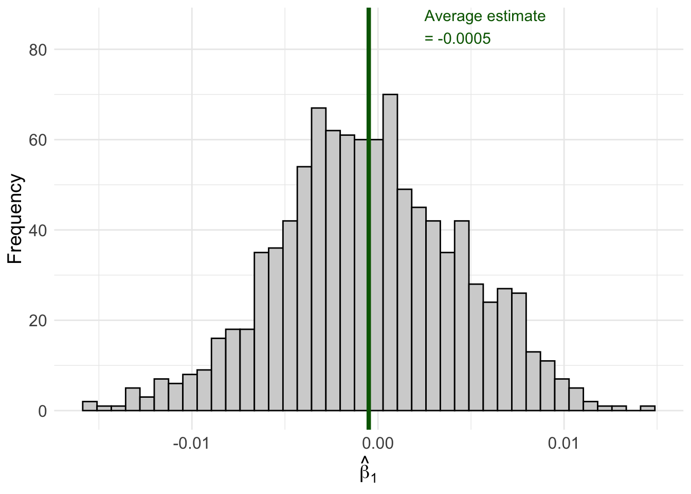
To understand why uncertainty matters, let’s run a simulation. Imagine we have a population where the true relationship between \(x\) and \(y\) is:
\[y = 2.45 + 0 \cdot x + \mu\]
Notice that the true effect of \(x\) on \(y\) is exactly zero. In the population, \(x\) has no effect on \(y\) whatsoever.
But what happens when we draw samples from this population and estimate OLS regressions? Let’s find out.
Code
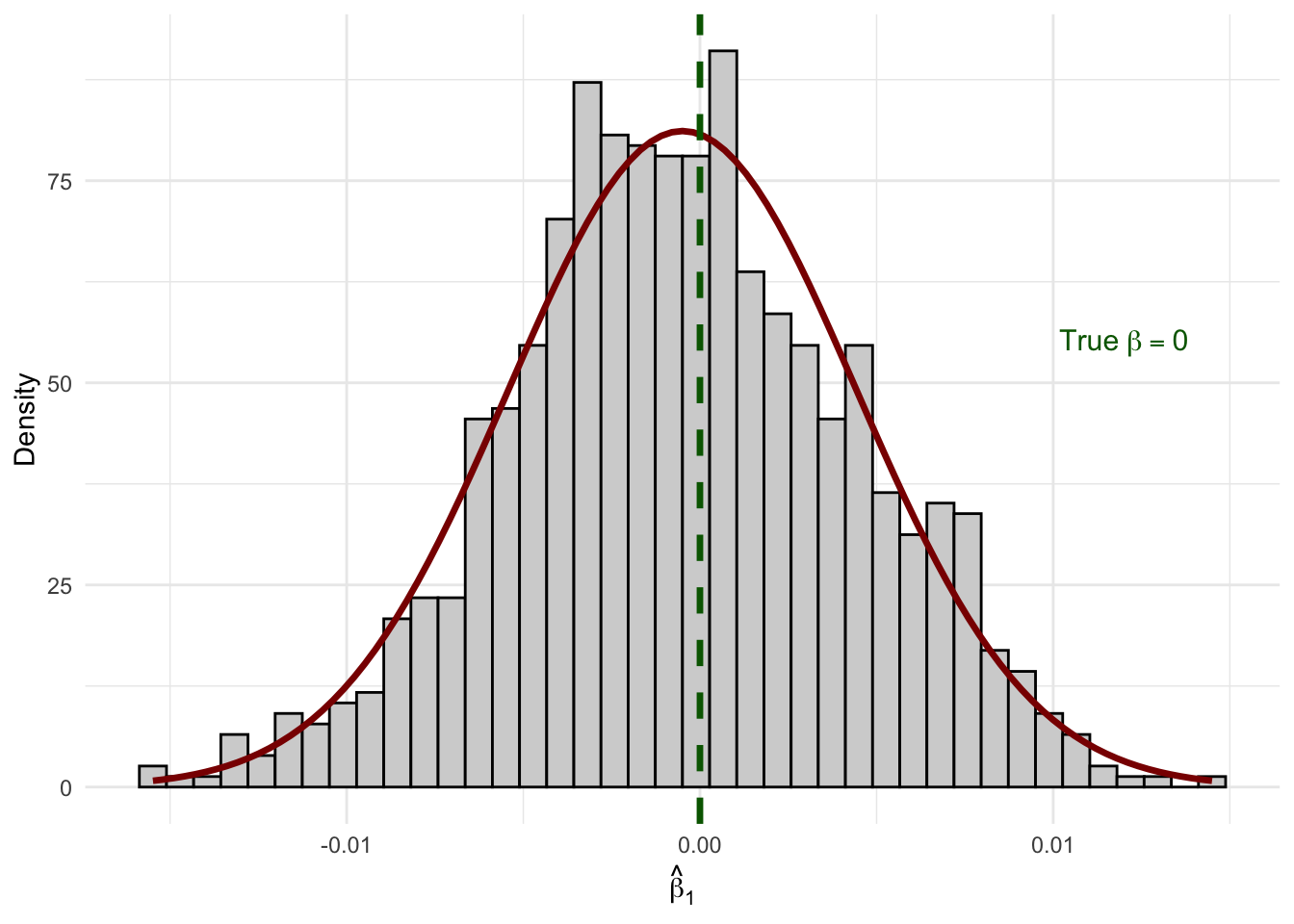
set.seed(124890)# Create our "population" datapop_data <-tibble(x =sample(1:100, size =1000, replace =TRUE),err =rnorm(1000),y =2.45+0* x + err # True beta_1 = 0)# Number of simulation repetitionsn_sims <-1000# Run the simulationsim_results <-map_dfr(1:n_sims, function(i) {# Draw a random sample of 50 observations sample_data <- pop_data |>slice_sample(n =50, replace =TRUE)# Estimate OLS regression reg <-lm(y ~ x, data = sample_data)# Store the estimatetibble(iteration = i,b1_hat =coef(reg)["x"] )})# Calculate the average estimateavg_estimate <-mean(sim_results$b1_hat)# Create the visualizationggplot(sim_results, aes(x = b1_hat)) +geom_histogram(fill ="lightgrey", color ="black", bins =40) +geom_vline(xintercept = avg_estimate, color ="darkgreen", linewidth =1.5) +annotate("text", x = avg_estimate +0.003, y =85,label =paste0("Average estimate\n= ", round(avg_estimate, 4)),color ="darkgreen", size =4, hjust =0) +labs(x =expression(hat(beta)[1]),y ="Frequency" ) +theme_minimal() +theme(axis.text =element_text(size =12),axis.title =element_text(size =14) )
Figure 6.1: Sampling distribution of β̂₁ when the true β₁ = 0. Each bar represents the frequency of estimates across 1,000 different samples.
Look at what happened! Even though the true \(\beta_1 = 0\), we got a distribution of different estimates ranging from about -0.02 to +0.02. Some samples produced positive estimates, others produced negative estimates. The average across all samples is very close to zero (as expected from unbiasedness), but any individual sample could give us an estimate that deviates from zero.
This distribution of estimates across all possible samples is called the sampling distribution of \(\hat{\beta}_j\).
6.3 Where Does Our Estimate Fall?
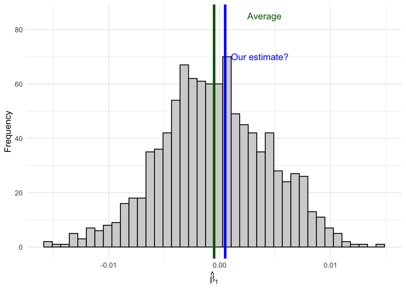
Now imagine you only have access to one sample—as is always the case in practice. You run your regression and get an estimate of, say, \(\hat{\beta}_1 = 0.001\).
How do you know if your estimate comes from here (close to the true value):
Figure 6.2: An estimate close to the average is likely consistent with the null hypothesis.
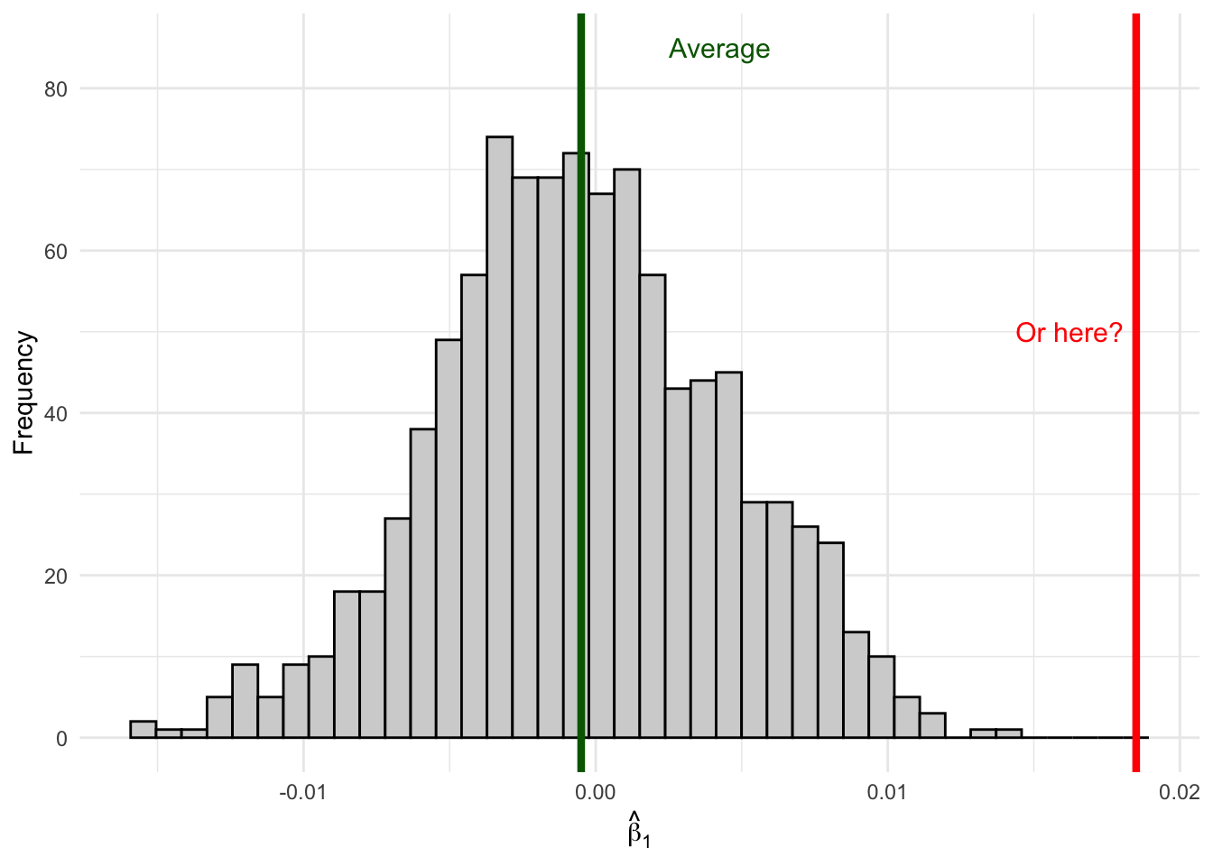
Or from here (far out in the tails):
Figure 6.3: An estimate in the tail is unlikely if the true effect is zero—suggesting the true effect might not be zero.
Remember, when you are out in the wild running regressions, you won’t actually be able to observe the full distribution of estimates since you have only one sample. Sure, the unbiasedness property will tell us that on average our estimate will be correct, but that only tells us about the center of our distribution, not where any specific estimate lays along the entire distribution. If your specific estimate from your one sample falls in the middle of the distribution where \(\beta_1 = 0\), it’s consistent with the null hypothesis of no effect. But if your estimate falls way out in the tails, it suggests that maybe the true \(\beta_1\) isn’t zero after all—because getting such an extreme estimate would be very unlikely if \(\beta_1\) really were zero.
The tools of statistical inference formalize this intuition.
6.4 The Sampling Distribution of \(\hat{\beta}_j\)
To conduct statistical inference, we need to make a few assumptions. We’ve already established two key properties of our OLS estimator (under the Gauss-Markov assumptions):
Expected Value (Unbiasedness):\[E[\hat{\beta}_j] = \beta_j\]
where \(SST_j\) is the total sum of squares of \(x_j\) and \(R^2_j\) is the R-squared from regressing \(x_j\) on all other independent variables.
But knowing the mean and variance isn’t enough—we need to know the shape of the distribution. (Recall from the previous chapter that we estimate \(\sigma^2\) from the residuals using \(\hat{\sigma}^2 = SSR/(n-k-1)\), which gives us the computable standard error \(se(\hat{\beta}_j) = \hat{\sigma}/\sqrt{SST_j(1 - R_j^2)}\).)
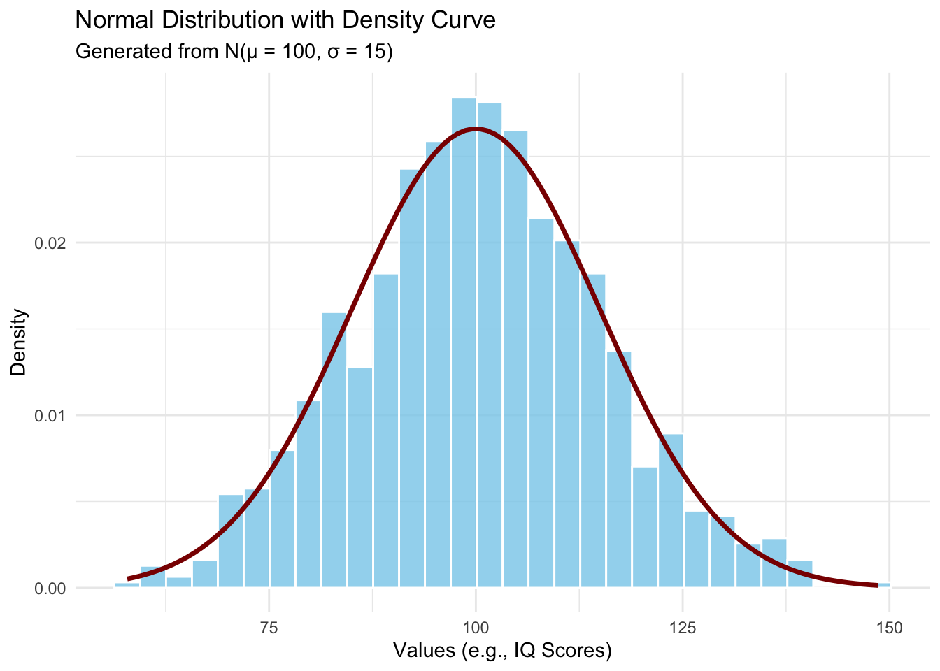
6.4.1 The Normality Assumption
To fully characterize the sampling distribution, we make an additional assumption:
ImportantNormality Assumption
The population error \(\mu\) is independent of the explanatory variables \(x_1, x_2, ..., x_k\) and is normally distributed with zero mean and variance \(\sigma^2\):
This says that conditional on the independent variables, the outcome \(y\) follows a normal distribution centered on the regression line.
Let’s visualize what a normal distribution looks like:
Code
set.seed(123)mu <-100sigma <-15normal_data <-tibble(values =rnorm(n =1000, mean = mu, sd = sigma))ggplot(normal_data, aes(x = values)) +geom_histogram(aes(y =after_stat(density)),bins =30,fill ="skyblue",color ="white",alpha =0.8) +stat_function(fun = dnorm,args =list(mean = mu, sd = sigma),color ="darkred",linewidth =1.2) +labs(title ="Normal Distribution with Density Curve",subtitle =paste0("Generated from N(μ = ", mu, ", σ = ", sigma, ")"),x ="Values (e.g., IQ Scores)",y ="Density" ) +theme_minimal()
Figure 6.4: The normal (Gaussian) distribution—the classic ‘bell curve.’ The example shows IQ scores, which are designed to follow N(100, 15).
At first glance, the normality assumption seems quite strong. For many economic variables—like wages, which are bounded below by zero and have a right skew—the distribution is clearly not normal. However, there’s good news: as long as our sample size is large enough, the sampling distribution of \(\hat{\beta}_j\) will be approximately normal even if the errors themselves aren’t normally distributed. This result is called asymptotic normality and follows from the Central Limit Theorem.
6.4.2 The Normal Sampling Distribution
Under the classical linear model (CLM) assumptions—that is, the Gauss-Markov assumptions plus the normality assumption—the normality of the error term directly gives us:
We already showed above that the sampling distribution of \(\hat{\beta}_1\) from our simulation looks like a bell curve. Let’s overlay the theoretical normal density to confirm:
Code
# Overlay a normal density on our simulation resultsggplot(sim_results, aes(x = b1_hat)) +geom_histogram(aes(y =after_stat(density)),fill ="lightgrey", color ="black", bins =40) +stat_function(fun = dnorm,args =list(mean =mean(sim_results$b1_hat),sd =sd(sim_results$b1_hat)),color ="darkred",linewidth =1.2 ) +geom_vline(xintercept =0, color ="darkgreen", linewidth =1.2, linetype ="dashed") +annotate("text", x =0.012, y =55,label ="True~beta == 0", parse =TRUE, color ="darkgreen", size =4) +labs(x =expression(hat(beta)[1]),y ="Density" ) +theme_minimal()
Figure 6.5: The sampling distribution of β̂₁ follows a normal distribution (red curve) centered on the true value.
The histogram of our 1,000 simulated estimates matches the theoretical normal curve almost perfectly. But in that simulation, the errors were drawn from a normal distribution. What if they aren’t?
6.4.3 Asymptotic Normality: Why It Still Works with Non-Normal Errors
In practice, we rarely believe the error term is truly normal. Wages are right-skewed. Health expenditures have a long right tail. Test scores may be bimodal. But here is the good news: by the Central Limit Theorem, as \(n \to \infty\), the sampling distribution of \(\hat{\beta}_j\) converges to a normal distribution regardless of the distribution of \(u\), provided the Guass-Markov assumptions hold and a few regularity conditions are satisfied. Formally:
The intuition is straightforward: \(\hat{\beta}_j\) is a weighted average of the \(y_i\) values, and by extension a weighted average of the \(u_i\). The CLT tells us that averages of independent random variables become approximately normal, even when the underlying variables are far from normal themselves.
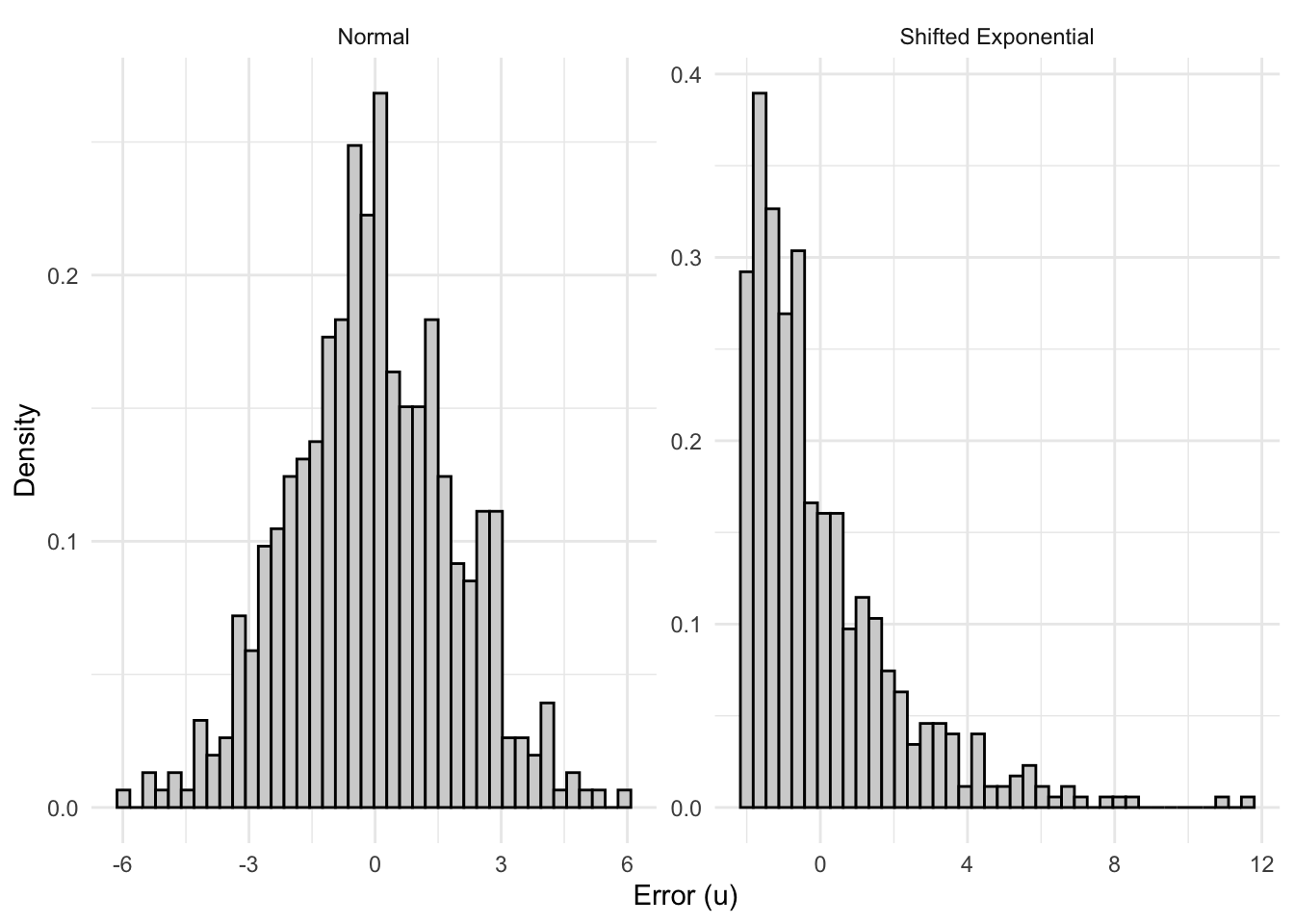
To see this in action, let’s compare two data generating processes: one where the errors are well-behaved (normal), and one where they are heavily skewed—as we might expect when modeling something like wages.
6.4.3.1 Model 1: Normal Errors
Our first DGP uses the classic setup with normally distributed errors:
set.seed(42)n_obs <-50# modest sample sizen_sims_asym <-2000beta0_true <-2beta1_true <-3# Store estimatessim_normal <-tibble(b1_hat =numeric(n_sims_asym))for (s in1:n_sims_asym) { x <-runif(n_obs, 1, 10) u <-rnorm(n_obs, mean =0, sd =2) # normal errors y <- beta0_true + beta1_true * x + u fit <-lm(y ~ x) sim_normal$b1_hat[s] <-coef(fit)["x"]}
6.4.3.2 Model 2: Skewed Errors (Wage-Like)
Now consider a model that looks more like a wage equation. Wages are right-skewed: most workers earn moderate amounts, but a long tail stretches toward high earners. We can capture this by drawing errors from a shifted exponential distribution, which is decidedly non-normal:
The errors here have a mean of zero (we shift the exponential so it’s centered), but they are heavily right-skewed with a skewness of 2—very far from the symmetric bell curve.
Code
sim_skewed <-tibble(b1_hat =numeric(n_sims_asym))lambda_rate <-0.5error_mean <-1/ lambda_rate # mean of Exp(0.5) is 2for (s in1:n_sims_asym) { x <-runif(n_obs, 1, 10) u <-rexp(n_obs, rate = lambda_rate) - error_mean # shifted so E[u] = 0, skewness = 2 y <- beta0_true + beta1_true * x + u fit <-lm(y ~ x) sim_skewed$b1_hat[s] <-coef(fit)["x"]}
6.4.3.3 Comparing the Error Distributions
Before looking at the sampling distributions, let’s see what a single draw of errors looks like in each case. The contrast is stark:
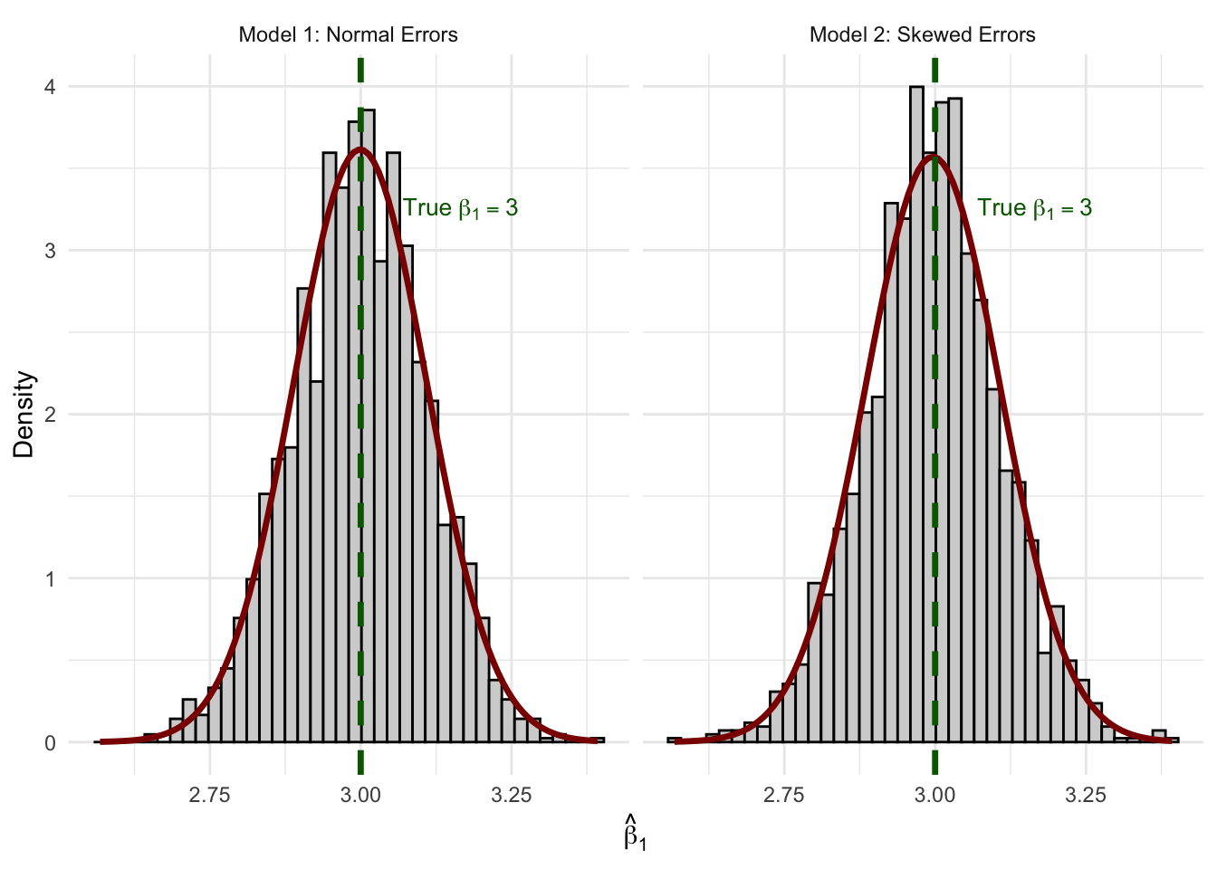
Figure 6.7: Sampling distributions of β̂₁ from 2,000 replications. Despite skewed errors in Model 2, both distributions are well-approximated by the normal curve (red).
The normal curve fits both histograms remarkably well. Even with \(n = 50\) and a heavily skewed error distribution, the CLT does its work. Both sampling distributions are centered on the true value \(\beta_1 = 3\) (unbiasedness), and both are well-approximated by a normal density.
This is why asymptotic normality is so powerful for applied econometrics: we don’t need to believe that wages, test scores, or health expenditures are normally distributed. We only need a large enough sample for the CLT to kick in—and in practice, \(n = 50\) is often sufficient.
NotePractical Implication
This result justifies our use of \(t\)-statistics and confidence intervals even when the dependent variable (and hence the errors) is clearly non-normal. When you estimate a wage equation and summary(lm(...)) reports \(p\)-values based on the \(t\)-distribution, it’s asymptotic normality doing the heavy lifting.
Quick Check: Understanding the Sampling Distribution
6.5 Hypothesis Testing
Now that we understand the sampling distribution, we can use it to make inferences about population parameters. The key idea is hypothesis testing: we hypothesize about the value of \(\beta_j\) in the population, then use our sample estimate to evaluate whether the hypothesis is plausible.
Here’s the roadmap: first, we’ll state the hypothesis. Then we’ll ask, “If the null hypothesis were true, what would the world look like?” Once we have that picture in mind, we’ll introduce the tool—the t-statistic—that lets us locate our estimate in that picture. Finally, we’ll formalize a decision rule.
6.5.1 The Null and Alternative Hypotheses
In econometrics, we’re usually interested in whether a variable has any effect on the outcome. We formalize this as:
Null Hypothesis:\(H_0: \beta_j = 0\)
The null hypothesis states that the variable \(x_j\) has no effect on \(y\) in the population (after controlling for other variables).
Alternative Hypothesis: We test the null against one of:
\(H_1: \beta_j \neq 0\) (two-sided test, most common)
\(H_1: \beta_j > 0\) (one-sided, if we expect a positive effect)
\(H_1: \beta_j < 0\) (one-sided, if we expect a negative effect)
The null hypothesis \(H_0: \beta_2 = 0\) states that, after controlling for education and tenure, experience has no effect on wages.
6.5.2 Step 1: What Does the World Look Like Under the Null Hypothesis?
Before we get to any formulas, let’s think about what the null hypothesis implies. If \(H_0: \beta_j = 0\) is true—that is, if the variable truly has no effect—then our non-zero estimate \(\hat{\beta}_j\) is just picking up random noise from sampling variation. Sometimes it’ll be a little positive, sometimes a little negative, but it should hover around zero.
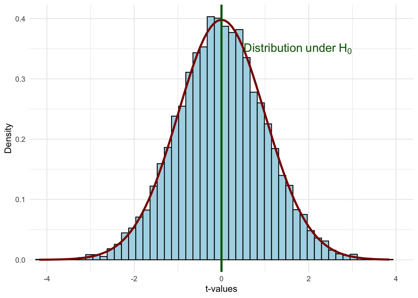
We already saw this in our simulation earlier: when the true \(\beta_1 = 0\), repeated sampling produced a bell-shaped distribution of estimates centered on zero. Under the null, the standardized version of our estimator follows a t-distribution:
Figure 6.8: The t-distribution under the null hypothesis H₀: βⱼ = 0. If the null is true, most standardized estimates will fall near zero.
This is the world we’re assuming when we conduct a hypothesis test. Most values cluster near zero, and values far from zero are rare. The question becomes: does our estimate look like it belongs in this distribution, or does it look like an outlier?
6.5.3 Step 2: The t-Statistic—Placing Our Estimate on the Distribution
Now we need a tool for locating where our particular estimate falls on that distribution. We can’t just use \(\hat{\beta}_j\) directly, because the scale depends on the units of measurement and the amount of noise in the data. Instead, we standardize the estimate by dividing by its standard error.
Recall that the standard error \(se(\hat{\beta}_j)\) measures the standard deviation of the sampling distribution of \(\hat{\beta}_j\)—it tells us how much our estimate would typically vary across repeated samples. A large standard error means there’s a lot of noise in our estimate; a small standard error means our estimate is relatively precise. When you run summary() on an lm() object in R, the standard error is reported in the Std. Error column right next to each coefficient.
We standardize by dividing our estimate by the standard error:
This is the t-statistic. It tells us: how many standard errors away from zero is our estimate? Under the null hypothesis, this quantity follows a t-distribution with \(n - k - 1\) degrees of freedom:
where \(\beta_j\) is the assumed value of the true population parameter under the null hypothesis, \(\hat{\beta}_j\) is the estimate, \(se(\hat{\beta}_j)\) is the standard error of the estimate, and \(n - k - 1\) are the degrees of freedom (sample size minus the number of parameters minus 1).
When testing \(H_0: \beta_j = 0\), the \(\beta_j\) in the numerator drops out, giving us the simple formula above.
The t-statistic has several useful properties:
Same sign as the estimate: Since \(se(\hat{\beta}_j) > 0\), the t-stat has the same sign as \(\hat{\beta}_j\)
Magnitude matters: As \(\hat{\beta}_j\) grows in magnitude, so does \(t_{\hat{\beta}_j}\)
Signal-to-noise ratio: The t-stat measures how large our estimate is relative to the noise (uncertainty) in our data
6.5.4 Step 3: How Far is “Too Far”?
Now we can put it all together. We have our imagined distribution of possible estimates under the null, and we have a t-statistic that tells us where our estimate falls on it. The question is: is our t-statistic close enough to zero to be consistent with the null, or is it so far out in the tails that we should doubt the null?
Code
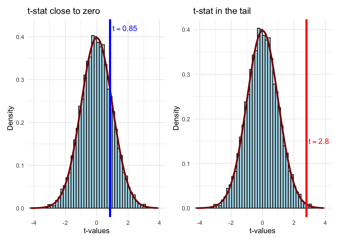
p_close <-ggplot(t_sample, aes(x = t_value)) +geom_histogram(aes(y =after_stat(density)),bins =50, fill ="lightblue", color ="black") +stat_function(fun = dt, args =list(df = df_value),color ="darkred", linewidth =1.2) +geom_vline(xintercept =0.85, color ="blue", linewidth =1.5) +annotate("text", x =0.85, y =0.42, label ="t == 0.85",parse =TRUE, color ="blue", size =4, hjust =-0.1) +labs(x ="t-values", y ="Density", title ="t-stat close to zero") +coord_cartesian(xlim =c(-4, 4)) +theme_minimal()p_far <-ggplot(t_sample, aes(x = t_value)) +geom_histogram(aes(y =after_stat(density)),bins =50, fill ="lightblue", color ="black") +stat_function(fun = dt, args =list(df = df_value),color ="darkred", linewidth =1.2) +geom_vline(xintercept =2.8, color ="red", linewidth =1.5) +annotate("text", x =2.8, y =0.15, label ="t == 2.8",parse =TRUE, color ="red", size =4, hjust =-0.1) +labs(x ="t-values", y ="Density",title ="t-stat in the tail") +coord_cartesian(xlim =c(-4, 4)) +theme_minimal()p_close + p_far
Figure 6.9: Two possible t-statistics: one at 0.85 (consistent with H₀) and one at 2.8 (in the tail, suggesting we reject H₀).
A t-statistic of 0.85 falls well within the “body” of the distribution—values like this occur frequently when \(H_0\) is true. We’d have no reason to doubt the null. But a t-statistic of 2.8 is out in the tail—such extreme values are rare when \(H_0\) is true. This is evidence that the null may not be correct.
6.5.5 Critical Values and Rejection Regions
So we have a way to measure whether our estimate is “far” from zero (the t-statistic), and we can see from the comparison above that values of \(t\) far out in the tails seem inconsistent with the null. But how far is far enough to reject the null? We need a formal decision rule.
The key concern is that we might make a mistake. Even when \(H_0\) is true, we could get an unlucky sample that produces a large t-statistic, leading us to reject a null that is actually correct. This is called a Type I error (a “false positive”). We want to control how often this happens.
The significance level\(\alpha\) is the probability of committing a Type I error—the probability of rejecting \(H_0\) when it is in fact true. By choosing \(\alpha\) before we look at the data, we set our tolerance for false positives. Common choices are 10%, 5%, and 1%.
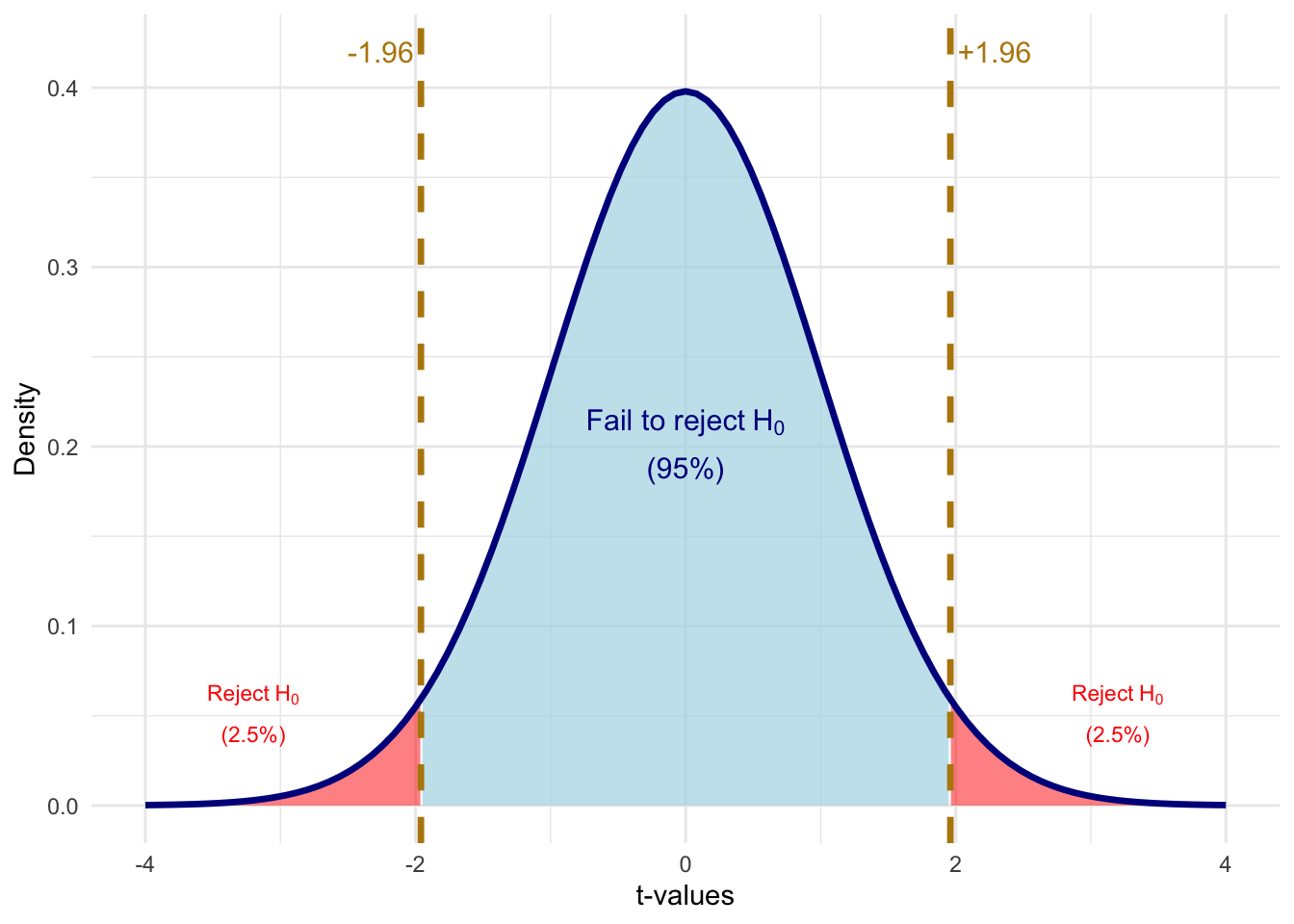
With the significance level in hand, we can define a critical value\(c\): the threshold on the t-distribution beyond which we reject \(H_0\). For a two-sided test at the 5% level, we reject \(H_0\) if \(|t_{\hat{\beta}_j}| > c\), where \(c\) is the value that leaves 2.5% of the distribution in each tail (so the total probability of being in either tail is 5%).
Code
# Calculate critical value for 5% significance, two-sidedalpha <-0.05c_val <-1.96# Create shading data for rejection regionst_grid <-seq(-4, 4, length.out =500)t_dens <-dt(t_grid, df = df_value)shade_data <-tibble(t_value = t_grid, density = t_dens) |>mutate(region =case_when( t_value <-c_val ~"reject", t_value > c_val ~"reject",TRUE~"fail_to_reject" ) )ggplot() +# Fail to reject region (blue)geom_ribbon(data = shade_data |>filter(region =="fail_to_reject"),aes(x = t_value, ymin =0, ymax = density),fill ="lightblue", alpha =0.7) +# Left rejection region (red)geom_ribbon(data = shade_data |>filter(t_value <=-c_val),aes(x = t_value, ymin =0, ymax = density),fill ="red", alpha =0.5) +# Right rejection region (red)geom_ribbon(data = shade_data |>filter(t_value >= c_val),aes(x = t_value, ymin =0, ymax = density),fill ="red", alpha =0.5) +# Distribution curvestat_function(fun = dt, args =list(df = df_value),color ="darkblue", linewidth =1.2) +# Critical value linesgeom_vline(xintercept =c(-c_val, c_val),color ="darkgoldenrod", linewidth =1.2, linetype ="dashed") +# Annotationsannotate("text", x =-c_val, y =0.42,label =paste0("-", round(c_val, 2)),color ="darkgoldenrod", size =4, hjust =1.1) +annotate("text", x = c_val, y =0.42,label =paste0("+", round(c_val, 2)),color ="darkgoldenrod", size =4, hjust =-0.1) +annotate("text", x =0, y =0.2,label ="atop('Fail to reject'~H[0], '(95%)')", parse =TRUE,color ="darkblue", size =4) +annotate("text", x =3.2, y =0.05,label ="atop('Reject'~H[0], '(2.5%)')", parse =TRUE,color ="red", size =3) +annotate("text", x =-3.2, y =0.05,label ="atop('Reject'~H[0], '(2.5%)')", parse =TRUE,color ="red", size =3) +labs(x ="t-values", y ="Density") +coord_cartesian(xlim =c(-4, 4)) +theme_minimal()
Figure 6.10: Critical values for a two-sided test at the 5% significance level. We reject H₀ if |t| > 1.96.
6.5.6 Hypothesis Testing Example
Let’s work through a complete example. We’ll create some simulated housing data and test whether lot area affects sale price:
# Create simulated housing dataset.seed(2025)n <-500housing_data <-tibble(lot_area =runif(n, 5000, 20000),pool_area =rbinom(n, 1, 0.15) *runif(n, 200, 600),garage_area =runif(n, 200, 800),year_built =sample(1960:2020, n, replace =TRUE),year_remod =pmax(year_built, sample(1980:2023, n, replace =TRUE)),# True relationship: lot_area has effect of $1.50 per sq ftsale_price =-2500000+1.50* lot_area +80* pool_area +150* garage_area +500* year_built +900* year_remod +rnorm(n, 0, 50000))# Estimate the regressionreg_housing <-lm(sale_price ~ lot_area + pool_area + garage_area + year_built + year_remod, data = housing_data)summary(reg_housing)
To test \(H_0: \beta_1 = 0\) (lot area has no effect), we extract the coefficient and standard error, compute the t-statistic, and compare it to a critical value. To find the critical value in R, we use the qt() function, which is R’s quantile function for the t-distribution. It returns the t-value that leaves a given probability in the tail. For a two-sided 5% test, we pass 0.025 (half of 0.05) to get the value that leaves 2.5% in each tail:
# Extract the coefficient and standard error for lot_areab1_hat <-coef(reg_housing)["lot_area"]se_b1 <-summary(reg_housing)$coefficients["lot_area", "Std. Error"]# Calculate the t-statistict_stat <- b1_hat / se_b1# Find the critical value at 5% significancesig_level <-0.05n_obs <-nobs(reg_housing)k <-5# number of independent variablesdf <- n_obs - k -1t_crit <-qt(sig_level /2, df = df, lower.tail =FALSE)# Display resultscat("Estimate:", round(b1_hat, 4), "\n")
Estimate: 1.5528
cat("Standard Error:", round(se_b1, 4), "\n")
Standard Error: 0.5207
cat("t-statistic:", round(t_stat, 2), "\n")
t-statistic: 2.98
cat("Critical value (5%):", round(t_crit, 2), "\n")
Critical value (5%): 1.96
cat("Reject H0?", abs(t_stat) > t_crit, "\n")
Reject H0? TRUE
Since \(|t_{\hat{\beta}_1}|\) exceeds the critical value of approximately 1.96, we reject the null hypothesis that lot area has no effect on sale price. The estimate is statistically significant at the 5% level.
6.5.7 Rule of Thumb
With modern datasets that have hundreds or thousands of observations, the critical value for a two-sided 5% test is essentially always 1.96 ≈ 2.
This gives us a handy rule of thumb:
TipThe “Rule of 2”
An estimate is statistically significant at the 5% level if:
\[|\hat{\beta}_j| > 2 \times se(\hat{\beta}_j)\]
In other words, if your estimate is more than twice as large as its standard error, you can reject the null hypothesis of no effect at the 5% level.
6.6 P-Values
While the t-test with a fixed significance level is useful, it has limitations. Saying an estimate is “significant at 5%” doesn’t tell us how strongly we reject the null. Was it a narrow rejection or a “knock out”?
The p-value answers this question.
Put differently, in the critical value approach, we pick a significance level (say 5%) and then ask whether our t-statistic exceeds the corresponding cutoff. The p-value flips this around. Instead of fixing the significance level and checking if we reject, the p-value asks: what is the smallest significance level at which we would still reject? If that number is very small (like 0.001), it means we’d reject even with an extremely strict threshold—strong evidence against the null. If it’s large (like 0.45), it means we’d need a very loose threshold to reject—weak or no evidence against the null.
More concretely, the p-value is the probability of observing a t-statistic as extreme (or more extreme) as the one we calculated, assuming the null hypothesis is true. It measures how “surprising” our data are under the null. A small p-value means the data would be very unlikely if \(H_0\) were true, which casts doubt on \(H_0\).
ImportantDefinition: P-Value
The p-value is the smallest significance level at which we would reject the null hypothesis.
Equivalently: the p-value is the probability of observing a t-statistic as extreme (or more extreme) as the one we calculated, if the null hypothesis were true.
WarningCommon Misconception
The p-value is not the probability that the null hypothesis is true. It is the probability of seeing data as extreme as ours if the null were true. This is a subtle but critical distinction. Saying “there’s a 3% chance that \(\beta_j = 0\)” is incorrect. The correct interpretation is: “if \(\beta_j\) really were zero, there’s only a 3% chance we’d observe an estimate this far from zero.”
6.6.1 Visualizing P-Values
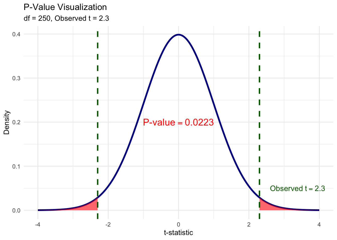
Let’s make this concrete. Suppose we run a regression and get a t-statistic of 2.3. To compute the p-value, we ask: “Under the null, what fraction of the t-distribution lies beyond \(\pm 2.3\)?” The red shaded area in the figure below is exactly that probability. We shade both tails because, for a two-sided test, an estimate of \(-2.3\) would be just as much evidence against the null as \(+2.3\). The total red area—the sum of both tails—is the p-value.
Figure 6.11: The p-value is the total shaded area in both tails beyond the observed t-statistic. Here, the observed t = 2.3, and the combined red area gives p ≈ 0.022.
6.6.2 Interpreting P-Values
The p-value tells us the probability of getting our estimate (or something more extreme) if the null were true:
p = 0.035: There’s a 3.5% chance of getting our estimate if \(\beta_j = 0\). That’s quite unlikely—evidence against \(H_0\).
p = 0.35: There’s a 35% chance of getting our estimate if \(\beta_j = 0\). That’s not unusual at all—no evidence against \(H_0\).
Common decision rules:
p < 0.10: Reject \(H_0\) at 10% level (weak evidence against \(H_0\))
p < 0.05: Reject \(H_0\) at 5% level (moderate evidence against \(H_0\))
p < 0.01: Reject \(H_0\) at 1% level (strong evidence against \(H_0\))
6.6.3 A Note on Language
When we cannot reject the null hypothesis, we say:
“We fail to reject the null at the x% level.”
We do not say we “accept” the null. Why? Because there are many possible values of \(\beta_j\) that we would also fail to reject. Failing to reject \(\beta_j = 0\) doesn’t mean \(\beta_j\) actually equals zero—it just means our data aren’t precise enough to distinguish \(\beta_j\) from zero.
6.6.4 Statistical vs. Practical Significance
WarningImportant Distinction
Statistical significance and practical (economic) significance are not the same thing!
A coefficient can be statistically significant but practically unimportant. This is especially common in very large samples, where even tiny effects can be detected.
For example, suppose we find that an additional year of education increases wages by $0.50 per year, and this is statistically significant with p < 0.001. Statistically, we’re very confident the effect isn’t zero. But practically, a 50-cent annual raise is economically trivial.
Always interpret the magnitude of coefficients, not just their statistical significance.
Quick Check: Hypothesis Testing
6.7 Confidence Intervals
Another way to quantify uncertainty is through confidence intervals. While hypothesis tests ask “is \(\beta_j\) different from zero?”, confidence intervals ask “what range of values is \(\beta_j\) likely to fall within?”
6.7.1 Computing a Confidence Interval
A confidence interval at the \((1 - \alpha)\) level is:
In practice, you don’t need to compute confidence intervals by hand. R’s confint() function does it for you. The first argument is the fitted model, the second specifies which coefficient (or omit it to get CIs for all coefficients), and level sets the confidence level (0.95 for a 95% CI):
confint(reg_housing, "lot_area", level =0.95)
             2.5 %  97.5 %
lot_area 0.5298262 2.57581
6.7.3 Interpreting Confidence Intervals
“We are 95% confident that the true effect of lot area on sale price is between $0.53 and $2.57 per square foot.”
What does “95% confident” actually mean? It does not mean there’s a 95% probability that the true \(\beta_j\) falls in this particular interval. The true \(\beta_j\) is a fixed number—it’s either in the interval or it isn’t. Rather, the “95%” refers to the procedure: if we drew 100 different samples from the same population and computed a 95% confidence interval from each one, about 95 of those intervals would contain the true \(\beta_j\), and about 5 would miss it. Any single interval is one draw from this process, and we don’t know whether ours is one of the lucky 95 or the unlucky 5.
This is why confidence intervals are so useful in practice: they give us a range of plausible values for the population parameter, not just a single point estimate. A narrow confidence interval means our estimate is precise; a wide one means there’s still a lot of uncertainty.
Key insight: There is a direct connection between confidence intervals and hypothesis testing. If the 95% confidence interval includes zero, then we cannot reject \(H_0: \beta_j = 0\) at the 5% level. Conversely, if the interval excludes zero, we can reject. This makes confidence intervals a handy visual shortcut: just check whether zero is inside or outside the interval.
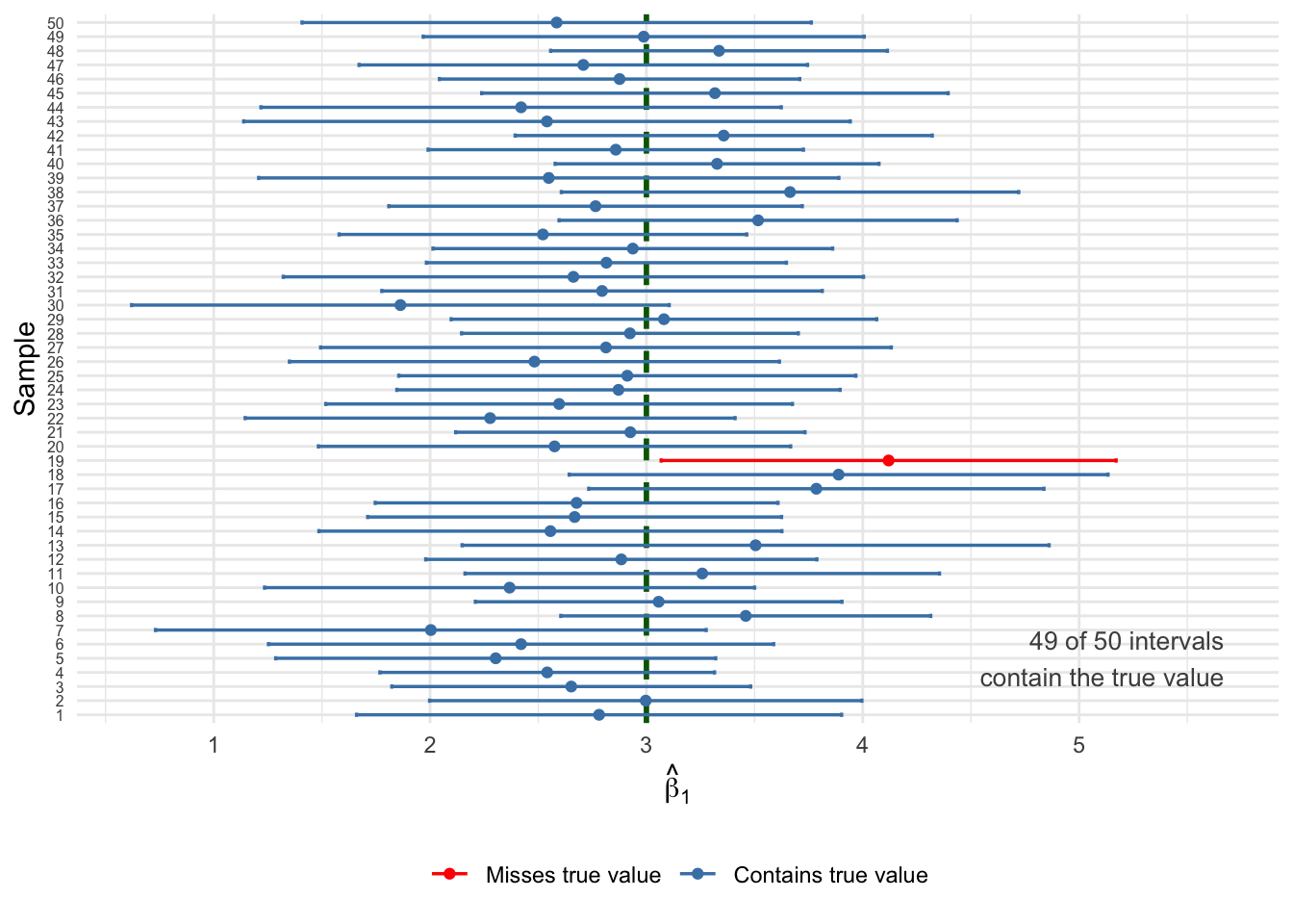
Let’s run a simulation to see what “95% confidence” really means. We’ll use a simple DGP with enough noise that some intervals will miss the true value—exactly as the theory predicts:
Code
set.seed(321)# Simple DGP: y = 5 + 3x + u, with enough noise to get some missestrue_b0 <-5true_b1_ci <-3n_per_sample <-30# small samples = wider CIs = more missesn_samples <-50ci_data <-map_dfr(1:n_samples, function(i) { x <-runif(n_per_sample, 0, 10) u <-rnorm(n_per_sample, 0, 8) # substantial noise y <- true_b0 + true_b1_ci * x + u reg <-lm(y ~ x) ci <-confint(reg, "x", level =0.95)tibble(sample = i,estimate =coef(reg)["x"],lower = ci[1],upper = ci[2],covers_true = lower <= true_b1_ci & upper >= true_b1_ci )})# Count coveragen_covered <-sum(ci_data$covers_true)ggplot(ci_data, aes(y =reorder(factor(sample), sample))) +geom_vline(xintercept = true_b1_ci, linetype ="dashed",color ="darkgreen", linewidth =1) +geom_errorbar(aes(xmin = lower, xmax = upper,color = covers_true),width =0.3, linewidth =0.6, orientation ="y") +geom_point(aes(x = estimate, color = covers_true), size =1.5) +scale_color_manual(values =c("TRUE"="steelblue", "FALSE"="red"),labels =c("TRUE"="Contains true value","FALSE"="Misses true value")) +annotate("text", x =max(ci_data$upper) -0.5+1, y =5,label =paste0(n_covered, " of ", n_samples, " intervals\ncontain the true value"),color ="grey30", size =3.5, hjust =1) +labs(x =expression(hat(beta)[1]),y ="Sample",color =NULL ) +theme_minimal() +theme(legend.position ="bottom",axis.text.y =element_text(size =6) )
Figure 6.12: Fifty 95% confidence intervals from different samples. The true β₁ = 3 (dashed line). Blue intervals contain the true value; red intervals miss it. About 95% of intervals should capture the truth.
Notice the red intervals: these are the roughly 5% of samples where the confidence interval happened to miss the true value. This is not a failure of the method—it’s exactly what “95% confidence” means. The procedure works correctly 95% of the time, but any individual interval might be one of the unlucky ones. This is why we say we are “95% confident” rather than “100% certain.”
6.8 T-Tests, P-Values, and CIs: A Comparison
These three approaches are closely related but answer slightly different questions:
Method
Question Answered
T-statistic
Is my estimate large relative to the noise in the data?
P-value
What’s the probability of seeing my estimate if \(H_0\) were true?
Confidence Interval
What range of values is plausible for \(\beta_j\)?
All three are mathematically connected:
If \(|t| > 1.96\), then p < 0.05, and the 95% CI excludes zero
If p < 0.05, then \(|t| > 1.96\), and the 95% CI excludes zero
If the 95% CI excludes zero, then p < 0.05 and \(|t| > 1.96\)
6.9 F-Tests: Testing Multiple Hypotheses
So far, all of our inference tools—t-tests, p-values, confidence intervals—have focused on testing one coefficient at a time. But in practice, we often want to ask broader questions. For instance, suppose you’re estimating a wage equation with education, experience, tenure, and age. You might want to know: “Do experience and tenure jointly matter for wages?” That’s not a question about a single \(\beta_j\)—it’s a question about multiple coefficients at once.
You might be tempted to just look at the individual t-tests for experience and tenure separately. But this approach has problems.
6.9.1 Why Not Just Use Multiple t-Tests?
There are two issues with testing each coefficient individually:
No restrictions on other parameters: A t-test on \(\beta_2\) puts no restrictions on \(\beta_3\). If the variables are correlated, this can be misleading. You could find that neither is individually significant, yet they jointly explain a lot of variation in the outcome.
Multiple comparisons problem: If you run many tests at the 5% level, you’ll reject some true null hypotheses just by chance. With 20 tests, you’d expect about 1 false rejection even if all nulls are true!
The F-test solves both problems by testing multiple coefficients simultaneously.
Suppose we want to test whether on-the-job training variables (experience and tenure) matter at all:
\[H_0: \beta_2 = \beta_3 = 0\]\[H_1: H_0 \text{ is not true}\]
The alternative is satisfied if either\(\beta_2 \neq 0\) or \(\beta_3 \neq 0\) (or both).
6.9.3 Computing the F-Statistic
The F-test compares two models:
Unrestricted Model: The full model with all variables \[UR: \widehat{\log(wage)} = \hat{\beta}_0 + \hat{\beta}_1(educ) + \hat{\beta}_2(exper) + \hat{\beta}_3(tenure) + \hat{\beta}_4(age)\]
Restricted Model: The model assuming the null is true (dropping the restricted variables) \[R: \widehat{\log(wage)} = \hat{\beta}_0 + \hat{\beta}_1(educ) + \hat{\beta}_4(age)\]
\(SSR_R\) = Sum of squared residuals from restricted model
\(SSR_{UR}\) = Sum of squared residuals from unrestricted model
\(q\) = Number of restrictions (variables dropped)
\(df_{UR}\) = Degrees of freedom in unrestricted model (\(n - k - 1\))
The intuition: if the restricted variables actually matter, then dropping them should make the model fit worse—that is, \(SSR_R\) should be much larger than \(SSR_{UR}\). The F-statistic captures how much worse the fit gets, scaled by the noise in the data.
6.9.4 F-Test Example
Let’s test whether year built and year remodeled jointly affect home prices:
# Unrestricted model (full model)reg_unrestricted <-lm(sale_price ~ lot_area + pool_area + garage_area + year_built + year_remod,data = housing_data)# Restricted model (dropping year variables)reg_restricted <-lm(sale_price ~ lot_area + pool_area + garage_area,data = housing_data)# Compute F-statistic manuallyssr_r <-sum(resid(reg_restricted)^2)ssr_ur <-sum(resid(reg_unrestricted)^2)df_ur <-df.residual(reg_unrestricted)q <-2# number of restrictionsf_numerator <- (ssr_r - ssr_ur) / qf_denominator <- ssr_ur / df_urf_stat <- f_numerator / f_denominator# Critical value at 5% significancef_crit <-qf(0.05, df1 = q, df2 = df_ur, lower.tail =FALSE)cat("F-statistic:", round(f_stat, 2), "\n")
F-statistic: 24.69
cat("Critical value (5%):", round(f_crit, 2), "\n")
Critical value (5%): 3.01
cat("Reject H0?", f_stat > f_crit, "\n")
Reject H0? TRUE
Since the F-statistic exceeds the critical value, we reject the null hypothesis. Year built and year remodeled are jointly statistically significant—they collectively improve the model’s fit.
6.9.5 Using R’s anova() Function
In practice, you’ll use R’s anova() function to perform F-tests. Pass it the restricted model first, then the unrestricted model:
anova(reg_restricted, reg_unrestricted)
Analysis of Variance Table

Model 1: sale_price ~ lot_area + pool_area + garage_area
Model 2: sale_price ~ lot_area + pool_area + garage_area + year_built +
    year_remod
  Res.Df           RSS Df    Sum of Sq      F           Pr(>F)
1    496 1420348267818
2    494 1291292854097  2 129055413721 24.686 0.00000000006048 ***
---
Signif. codes:  0 '***' 0.001 '**' 0.01 '*' 0.05 '.' 0.1 ' ' 1
The output shows the F-statistic, degrees of freedom, and p-value directly.
6.9.6 The F-Statistic in Terms of R²
The F-statistic can also be written in terms of R-squared values:
This shows that the F-test is essentially asking: Does the unrestricted model fit the data significantly better than the restricted model?
If \(R^2_{UR}\) is much larger than \(R^2_R\), the F-statistic will be large, and we’ll reject the null.
NoteProperties of the F-Test
The F-statistic is always non-negative, so F-tests are always one-sided
If the null is rejected, we say the variables are jointly statistically significant
We cannot determine which individual variable is significant—only that at least one is
If variables are jointly insignificant, it provides justification for dropping them from the model
6.10 Reading Regression Tables
Now that we have the full toolkit of statistical inference—t-tests, p-values, confidence intervals, and F-tests—we can properly interpret the regression tables you’ll encounter in academic papers.
6.10.1 Decoding R’s summary() Output
Let’s start with what you already know: the output from summary() in R. It packs a lot of information into one screen, and now that we’ve covered t-statistics, p-values, and confidence intervals, we can decode every piece of it.
The output has several blocks. Let’s walk through them.
The Coefficients Table is the most important part. It has four columns:
Estimate: You know this one. It is the OLS point estimates \(\hat{\beta}_j\). For lot area, this is the estimated effect of one additional square foot of lot area on sale price.
Std. Error: The standard error \(se(\hat{\beta}_j)\) (i.e., the square root of the variance) of each estimate. This measures the precision of our estimate—how much it would typically vary across repeated samples. Smaller standard errors mean more precise estimates.
t value: The t-statistic based on a null hypothesis where \(H_0 = 0\), computed as Estimate / Std. Error. This is exactly the calculation we did by hand earlier. It tells us how many standard errors our estimate is from zero.
Pr(>|t|): The p-value for the two-sided test \(H_0: \beta_j = 0\). Smaller numbers mean stronger evidence against the null. A value below 0.05 means the estimate is statistically significant at the 5% level.
Significance Stars appear to the right of the p-values as a quick visual guide:
No star: not significant at the 10% level (\(p \geq 0.10\))
. : significant at 10% but not 5% (\(0.05 \leq p < 0.10\))
* : significant at 5% but not 1% (\(0.01 \leq p < 0.05\))
** : significant at 1% but not 0.1% (\(0.001 \leq p < 0.01\))
*** : significant at 0.1% (\(p < 0.001\))
More stars = stronger evidence against the null. But remember: statistical significance is not the same as practical significance!
Residual standard error (\(\hat{\sigma}\)) is an estimate of the standard deviation of the error term \(u\). It tells you the typical size of the prediction error in the units of \(y\). The degrees of freedom (\(n - k - 1\)) appear next to it. This is not something that is useful on its own, so we won’t refer to it very often.
Multiple R-squared (\(R^2\)) is the fraction of variation in \(y\) explained by the model. Adjusted R-squared penalizes for adding more variables and is generally preferred for comparing models with different numbers of regressors, as discussed in Chapter 5.
F-statistic at the bottom tests the joint null hypothesis that all slope coefficients are zero: \(H_0: \beta_1 = \beta_2 = \cdots = \beta_k = 0\). This asks: “Does this model explain anything at all?” A large F-statistic (or small p-value) means the model as a whole is statistically significant. We covered F-tests earlier in this chapter.
6.10.2 From R Output to Publication Format
While summary() gives us everything we need, academic papers present this information in a standardized, cleaner format. In a publication, the same regression would appear as:
Table 6.1: The Effect of Lot Area on Home Sale Price
Sale Price
* p < 0.1, ** p < 0.05, *** p < 0.01
Standard errors in parentheses.
(Intercept)
-2369345.453***
(407348.898)
Lot Area (sq ft)
1.553***
(0.521)
Pool Area
81.552***
(14.698)
Garage Area
167.084***
(13.493)
Year Built
554.285***
(143.828)
Year Remodeled
775.747***
(223.586)
Num.Obs.
500
R2
0.340
R2 Adj.
0.333
6.10.3 Decoding the Table Structure
Rows are variables: The top indicates the dependent variable. Rows below show independent variables and the constant (intercept).
The main numbers are coefficients: Each cell contains \(\hat{\beta}_j\).
Numbers in parentheses are standard errors: These are \(se(\hat{\beta}_j)\).
Stars indicate significance levels:
* = significant at 10% level (p < 0.10)
** = significant at 5% level (p < 0.05)
*** = significant at 1% level (p < 0.01)
Bottom statistics: Sample size (N), R-squared, and sometimes other diagnostics.
6.10.4 Multiple Columns Show Robustness
Most regression tables have multiple columns, each representing a different specification. This lets readers see how estimates change as controls are added:
# Three specifications with increasing controlsreg1 <-lm(sale_price ~ lot_area, data = housing_data)reg2 <-lm(sale_price ~ lot_area + pool_area + garage_area, data = housing_data)reg3 <-lm(sale_price ~ lot_area + pool_area + garage_area + year_built + year_remod, data = housing_data)
Table 6.2: The Effect of Lot Area on Home Sale Price: Multiple Specifications
(1)
(2)
(3)
* p < 0.1, ** p < 0.05, *** p < 0.01
Standard errors in parentheses.
(Intercept)
385464.906***
288761.744***
-2369345.453***
(8462.611)
(10454.349)
(407348.898)
Lot Area (sq ft)
1.038
1.472***
1.553***
(0.635)
(0.545)
(0.521)
Pool Area
86.081***
81.552***
(15.352)
(14.698)
Garage Area
170.687***
167.084***
(14.112)
(13.493)
Year Built
554.285***
(143.828)
Year Remodeled
775.747***
(223.586)
Num.Obs.
500
500
500
R2
0.005
0.274
0.340
R2 Adj.
0.003
0.269
0.333
Notice how the coefficient on Lot Area changes across specifications. In column (1), without controls, the estimate is different from column (3). This pattern often reveals omitted variable bias in simpler specifications.
6.10.5 What to Look for in Regression Tables
What is the coefficient on the variable of interest? How do we interpret it?
Is it statistically significant? At what level?
How does the coefficient change across specifications? Does it remain stable or shift dramatically?
Are the sample size and R-squared reasonable? Very small N or very low R² might raise concerns.
Practice: Reading a Regression Table
Consider this table examining the effect of stock performance on CEO salary:
Effect of Stock Performance on CEO Salary
(1)
(2)
* p < 0.1, ** p < 0.05, *** p < 0.01
(Intercept)
6.806***
4.788***
(0.041)
(0.234)
Return on Stock (%)
0.001
0.001
(0.001)
(0.001)
Log(Sales)
0.287***
(0.033)
Num.Obs.
209
209
R2 Adj.
-0.004
0.264
6.11 Chapter Summary
TipKey Takeaways
Statistical inference allows us to move from sample estimates to statements about population parameters, accounting for sampling variability.
The sampling distribution of \(\hat{\beta}_j\) describes how our estimates would vary across repeated samples. Under the normality assumption (or with large samples), it follows a normal distribution.
Hypothesis testing uses the t-statistic to determine whether our estimate is “far enough” from zero to reject the null hypothesis: \(t = \hat{\beta}_j / se(\hat{\beta}_j)\)
P-values tell us the probability of seeing our data if the null were true. Smaller p-values provide stronger evidence against \(H_0\).
Confidence intervals provide a range of plausible values for the population parameter. A 95% CI excludes zero if and only if the estimate is significant at the 5% level.
Statistical significance ≠ practical significance. Always consider the magnitude of effects, not just their p-values.
F-tests allow us to test multiple hypotheses simultaneously, avoiding the multiple comparisons problem.
Regression tables in academic papers present coefficients, standard errors (in parentheses), and significance stars. Multiple columns show robustness across specifications.
6.12 Practice Exercises
Practice: Interpreting t-Statistics and Hypothesis Testing
Scenario: Consider a regression where \(\hat{\beta}_1 = 2.5\) and \(se(\hat{\beta}_1) = 0.8\). Assume a large sample size (df > 100).
Practice: Understanding P-Values
Practice: Statistical vs. Practical Significance
Practice: F-Tests for Joint Hypotheses
Scenario: You estimate a model of house prices with: lot area, garage size, bedrooms, bathrooms, year built, and 20 neighborhood dummy variables. You want to test whether neighborhood matters for house prices.
Practice: Reading Regression Tables
Regression Output: A researcher studies the determinants of college GPA:
Note: athlete = 1 if varsity athlete; legacy = 1 if parent attended the college
TipShow Explanation
t-Statistics and Hypothesis Testing (i-v):
The t-statistic is calculated as \(t = \hat{\beta}_1 / se(\hat{\beta}_1) = 2.5 / 0.8 = 3.125\).
Since \(|t| = 3.125 > 1.96\), we reject \(H_0\) at the 5% level. The estimate is statistically significant.
Since \(|t| = 3.125 > 2.58\), we also reject \(H_0\) at the 1% level. The estimate is highly significant.
The 95% CI is \(\hat{\beta}_1 \pm 1.96 \times se(\hat{\beta}_1) = 2.5 \pm 1.96 \times 0.8 = 2.5 \pm 1.568 = [0.93, 4.07]\).
Since 4 falls within the confidence interval [0.93, 4.07], we cannot reject the hypothesis that \(\beta_1 = 4\) at the 5% level. The CI supports (or at least doesn’t contradict) this claim.
Understanding P-Values (vi-x):
The p-value is the probability of observing data as extreme as ours if the null hypothesis were true. It is NOT the probability that the null is true.
With p = 0.001, we can reject at all three levels (10%, 5%, and 1%) because 0.001 < 0.01 < 0.05 < 0.10.
With p = 0.047, we can reject at 10% (0.047 < 0.10) and 5% (0.047 < 0.05), but not at 1% (0.047 > 0.01).
With p = 0.082, we can only reject at 10% (0.082 < 0.10), but not at 5% (0.082 > 0.05) or 1%.
With p = 0.523, we cannot reject at any conventional level. There is a 52.3% chance of seeing data this extreme if \(H_0\) were true—not unusual at all.
Statistical vs. Practical Significance (xi-xii):
A $50/year effect is statistically significant (p < 0.001) but practically trivial. This is less than 25 cents per hour—hardly worth an extra year of schooling! Large samples can detect tiny effects.
The standard error shrinks as \(n\) increases (specifically, \(se \propto 1/\sqrt{n}\)). With huge samples, even tiny deviations from zero become “detectable” statistically, even if they’re meaningless practically.
F-Tests (xiii-xvi):
The null hypothesis is that ALL 20 neighborhood coefficients equal zero jointly: \(H_0: \beta_{n1} = \beta_{n2} = ... = \beta_{n20} = 0\). If any neighborhood differs from the baseline, \(H_0\) is false.
You are testing 20 restrictions—one for each neighborhood dummy variable set to zero.
Since F = 3.45 > 1.57 = critical value, we reject \(H_0\). Neighborhoods are jointly statistically significant—they collectively help explain house prices.
Rejecting the joint null only tells us that at least one neighborhood coefficient differs from zero. Some individual neighborhoods might not be significantly different from the baseline—we’d need individual t-tests to determine which ones.
Reading Regression Tables (xvii-xxi):
The coefficient on SAT is 0.001, meaning each 1-point increase in SAT is associated with a 0.001 increase in GPA. For 100 points: \(100 \times 0.001 = 0.1\) GPA points.
The p-value for athlete is 0.171, which is greater than 0.05. Therefore, the coefficient is NOT statistically significant at the 5% level.
The coefficient on legacy (0.142) is the difference in predicted GPA between legacy and non-legacy students, holding other variables constant. Legacy students are predicted to have GPAs 0.142 points higher.
The 95% CI is \(-0.085 \pm 1.96 \times 0.062 = -0.085 \pm 0.122 = [-0.207, 0.037]\). This interval includes zero.
When a 95% CI includes zero, it means we cannot reject \(H_0: \beta = 0\) at the 5% level—which is consistent with the p-value being 0.171 > 0.05. The CI and hypothesis test always agree.
Wooldridge, Jeffrey M. 2019. Introductory Econometrics: A Modern Approach. 7th ed. Cengage Learning.